Achieving Consistent Donor Recognition Design Standards: A story of success at Asheville-Buncombe Technical College
Donor recognition is a curious type of sign in the scope of all sign making. It can take several forms, such as lists, groupings of plaques within a single frame, or in the case of named spaces, individual plaques positioned in a wide variety of environments. The design of the plaques is influenced by the architectural environment in which it is placed; the personal preferences of the people involved in deciding content, size, materials and cost; and even directives or requests presented by the donor being recognized. Over time, many nonprofit organizations find themselves with a wide variety of signs and little documentation to guide them toward consistency.
Consistency in terms of donor recognition need include only one overarching idea: a hierarchy of content and plaque sizes that align with categories based on gift amount. To maintain consistency, one party, usually the fundraising entity, should lead the donor recognition effort providing vision and final responsibility for carrying out the plan. However, success depends on effective collaboration with other stakeholders, including leadership, marketing, facilities, and the donors to be recognized.
Each organization will decide the number of categories, the corresponding gift sizes, and the content appropriate storytelling style of the organization’s brand. For instance, most organizations have three to five plaque sizes. They include more content for plaques associated with larger gifts with smaller space naming plaques including the title of the space, the donor’s full name and the date of the gift. Larger gifts may also include architectural lettering, a portrait, and more story about the donor and/or the impact of the gift.



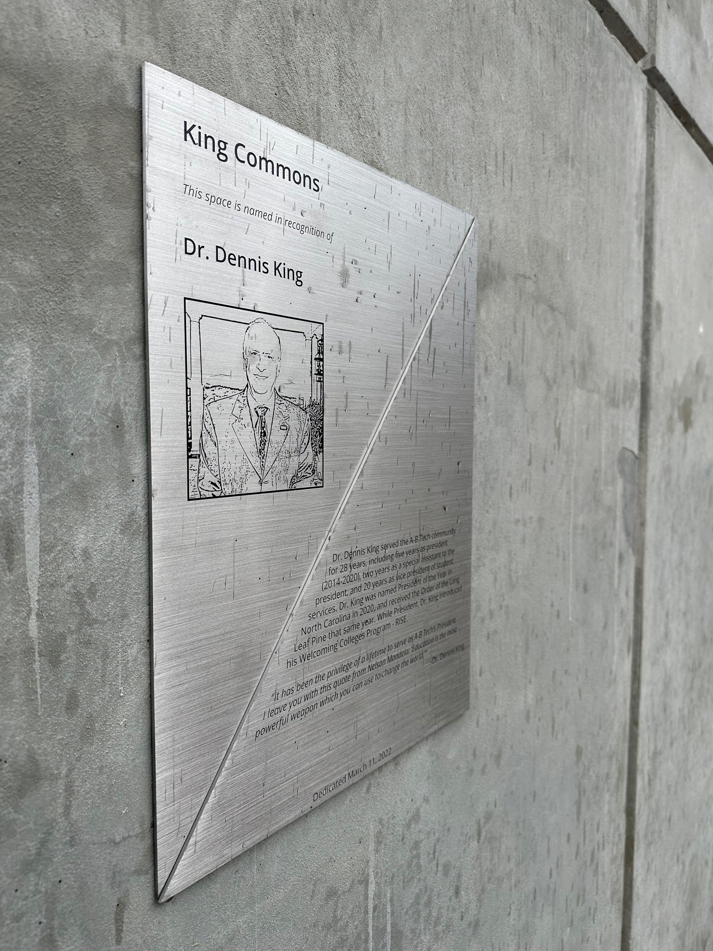
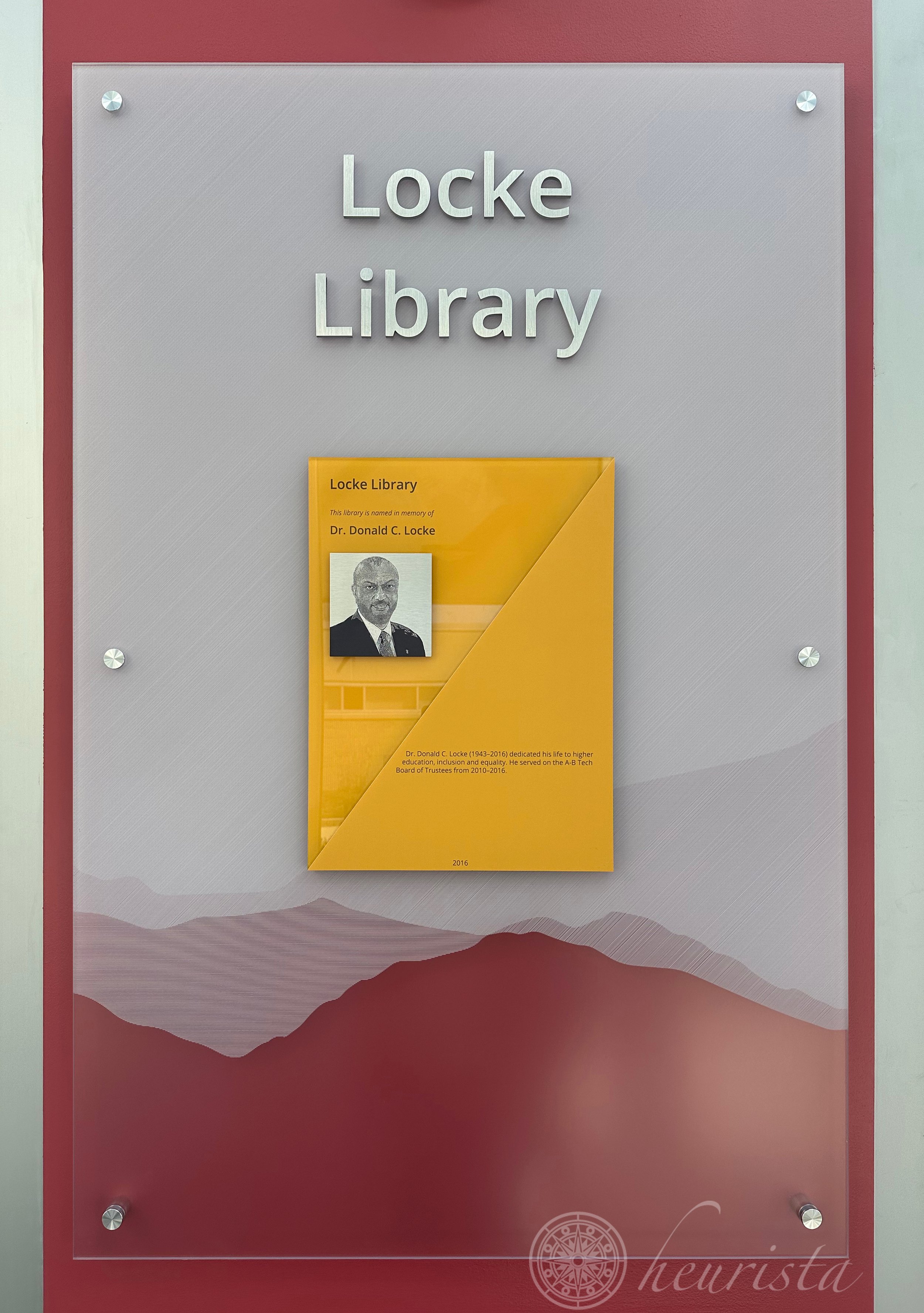





Other organizations, especially those who want to emphasize the throughline of philanthropic giving across campus, will opt for consistent design outcomes in addition to standardized content and sizes. When this is the case, donor recognition signage uses similar colors, fonts and materials across all instances on campus and additional effort is placed on providing similar distinction within the architectural environment for all donor recognition. This is achieved by situating donor recognition signage in prominent locations, opting for special wall treatments, and integrating special lighting.
On rare occasions, Heurista has been asked to replace older donor recognition as we are introducing new design standards. Such was the case at Asheville-Buncombe Technical College in Asheville, North Carolina. With the advent of new leadership in the president’s office, the marketing team, and the foundation, consensus was reached about replacing many instances of older donor recognition signage to better represent the importance placed on philanthropy at A-B Tech. In some cases, new locations were identified, providing more prominence for the donor recognition. When needed, story was added and the design of all plaques took advantage of the new, bold graphics aligned with the A-B Tech brand.
The following photographs illustrate a few examples of the original plaques and the updated versions that were installed at A-B Tech. We look forward to further expanding this donor recognition program to include grouped recognition for named endowments and digital recognition solutions that can be displayed on campus and shared with the community via social media and other online mechanisms.


